
...
| Sv translation | ||||||||||||||||||||||||||||||||||||||||||||||||||||||||||||||||||||
|---|---|---|---|---|---|---|---|---|---|---|---|---|---|---|---|---|---|---|---|---|---|---|---|---|---|---|---|---|---|---|---|---|---|---|---|---|---|---|---|---|---|---|---|---|---|---|---|---|---|---|---|---|---|---|---|---|---|---|---|---|---|---|---|---|---|---|---|---|
| ||||||||||||||||||||||||||||||||||||||||||||||||||||||||||||||||||||
Adaptive layoutWhen setting up the homepage blocks, it is possible to upload images in different size for display on a computer and on a mobile device. This allows you to implement full adaptability to display the page on any device. An example of displaying the main page on a computer:
An example of displaying the main page on a tablet:
An example of displaying the main page on the phone:
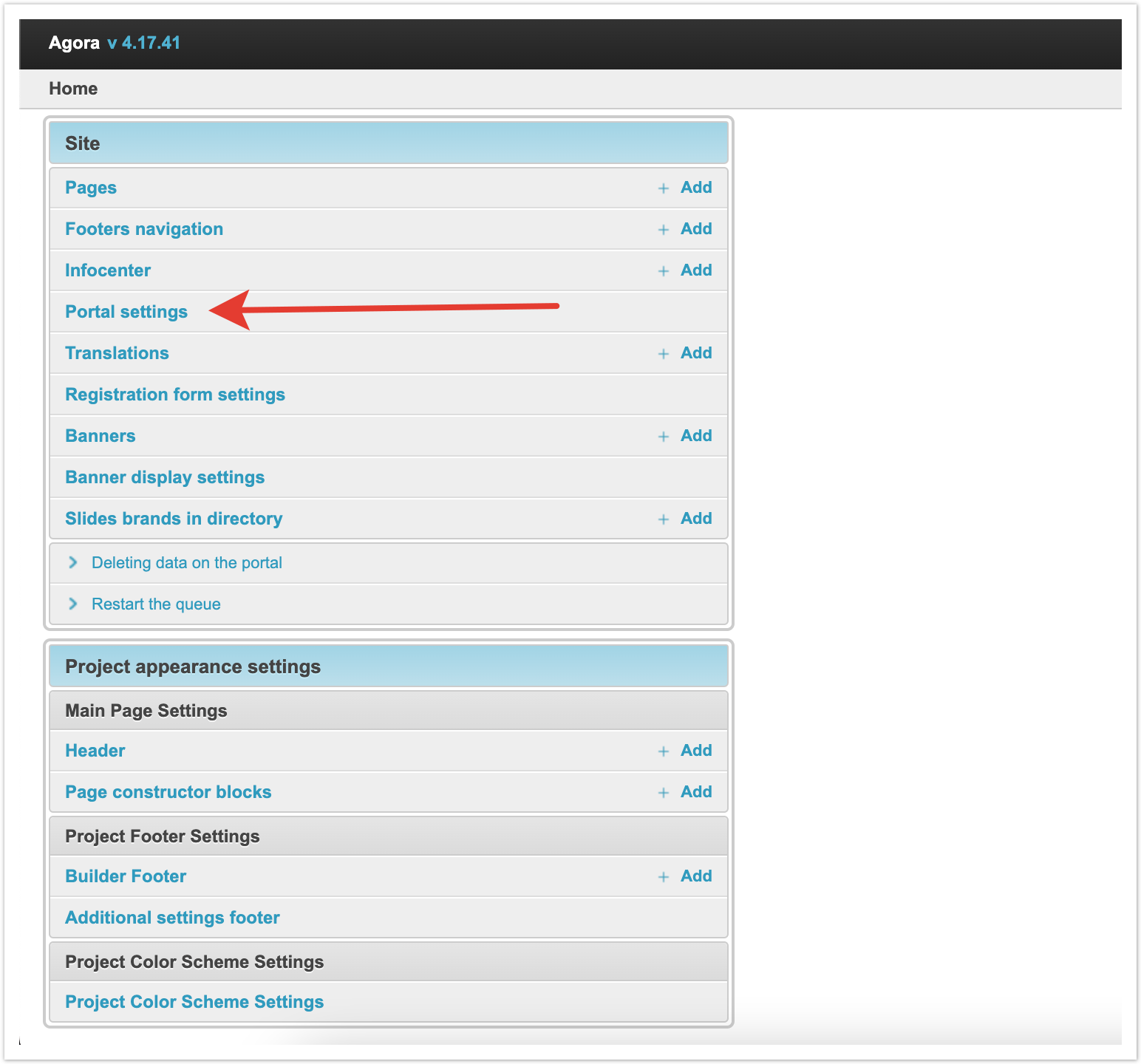
Connecting the home page builderYou can use the standard view of the main page or customize it individually through the designer. The main page builder is connected through the admin panel. You need to go to the Portal settings section.
In the Information about the portal section, set the checkbox Enable Main Page Builder. Next, you need to save the changes for the setting to take effect.
After that, using the settings of the main project page, you can change its appearance.
Setting up the site headerHeader is located at the top of the page and contains by default:
In addition, a block of information, a currency exchange rate, a language switcher, a contact phone number and a button to enter your personal account can also be displayed on top.
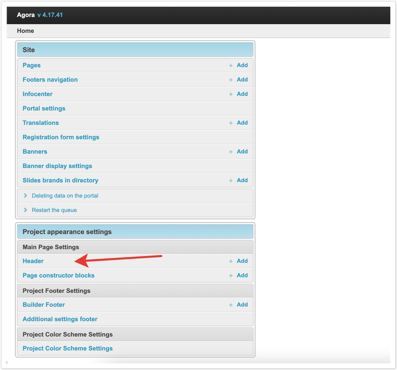
All other sections are configured manually through the admin panel. To set the page header, go to the Header section.
The page that opens displays the header sections that were previously configured.
Position in the status bar - this column, using the Drag-and-drop functionality, allows you to change the order in which sections are displayed on the page. It is enough to drag the gray rectangle in the desired line and move it to the place that it should occupy. ID - unique identifier of the section. Name - the name of the section that will be displayed on the main page. Icon - a visual display that will also be displayed on the main page. URL - the address of the link that will be followed by clicking on this section on the main page. Removing header sectionsTo delete some of the available sections of the header, you need to select them with checkboxes in the first column, and then select Delete selected Header from the drop-down list at the bottom left.
Adding Header SectionsTo add a new section to the header, click the Add Header button in the upper right corner of the page.
On the page that opens, you need to fill in the fields to add a new section.
Name - this field specifies the name that will be displayed on the main page. If multilanguage is enabled on the platform, you can specify the name in different languages. URL - the address of the link that will be followed by clicking on this section on the main page. The URL address can lead both to internal pages of the platform and to external sites. Icon - a visual display that will also be displayed on the main page. You can select an icon from the available catalog, which includes several hundred images. For convenience, a search bar is displayed that allows you to find an icon by name.
If the list of icons does not contain the one you need, you can download it yourself. To do this, select Upload your own icon, and then select a SVG file on your computer and add it to the platform. The recommended size for the icon is 16x16 px.
After all the required parameters have been filled in, you need to save the Header and it will appear in the list.
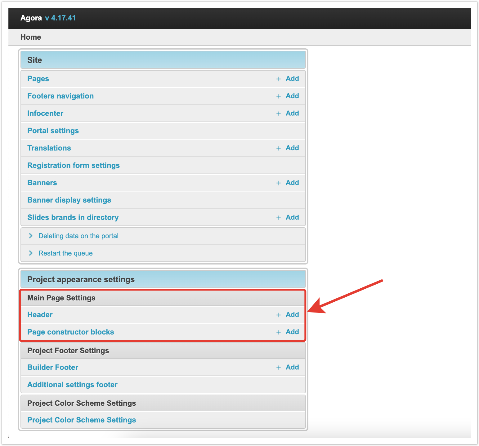
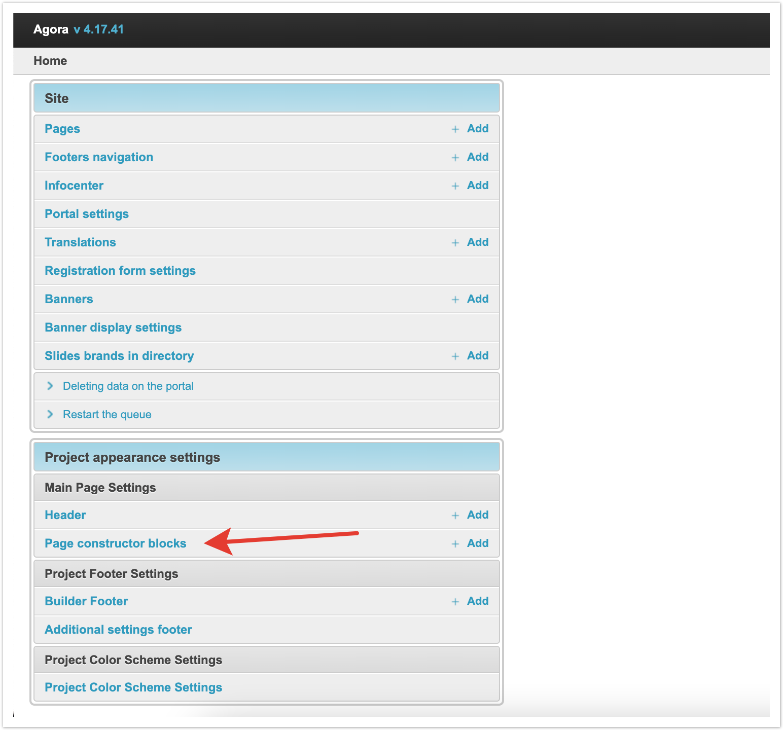
Setting up homepage blocksBelow the header, the main page blocks are displayed. The configuration is done through the admin panel in the Page constructor blocks of the page builder.
On the page that opens, the blocks of the main page that were entered earlier are displayed.
Position in the status bar - this column, using the Drag-and-drop functionality, allows you to change the order in which blocks are displayed on the page. It is enough to drag the gray rectangle in the desired line and move it to the place that it should occupy. ID - unique identifier of the page constructor block. Name - the name of the block, which will allow the platform administrator to better navigate. Some of the titles will be displayed on the main page. Block type - this column displays the type of this block. More about block types will be described below. Removing Page constructor BlocksTo remove some of the available page builder blocks, you need to select them with checkboxes in the first column, and then select Delete selected Page constructor blocks from the drop-down list at the bottom left.
|


| Якорь | ||||
|---|---|---|---|---|
|

Slider
| Информация | ||
|---|---|---|
| ||
This type of block allows you to upload multiple images that will scroll through the slider. Recommended image sizes for the slider: For desktop version - 1380x300 px For mobile version - 800x285 px |

Consider the slider setup procedure.

Name - the name of the block, which will allow the platform administrator to better navigate. It will not appear on the main page. If multilanguage is enabled on the platform, you can specify the name in different languages in the corresponding fields.
Preview - in this field you can see an example of the display of this block.
In the Slider block, you can enable the Autochange checkbox so that the image changes automatically. If the setting is disabled, then switching images will only be available manually.
Change time - this field specifies the time in seconds after which the images will be changed.
In the Banners section on the main page, you can upload images for banners. To do this, click on the "+".

Fields for uploading and customizing the image will appear. In the Image column, select the file you want to upload.Якорь banner banner
In the Slider banner for desktop version and Slider banner for mobile version columns, you can see the format for the respective versions and select the display area.
In the File for column, you can select the version for which the image is being uploaded. You can upload separate images in different size for the desktop and mobile versions of the page display.
The URL adress column contains the link that will be followed when clicking on the banner. The link may lead to sections of the platform or to third-party sites.
In the Display order column, you can set the order in which images are displayed in the slider.

This way you can upload all the images that should be displayed in the slider. At the same time, you can upload images of different size for mobile and desktop versions. For each image, you can select the display area that will be displayed on the main page.
3 banners in a row - one size
| Информация | ||
|---|---|---|
| ||
This type of block allows you to upload 3 images for banners, which will be displayed in one row and of same size. Recommended sizes for 3 banners in a row of the same size: For desktop version - 460x205 px For mobile version - 120x115 px |

Consider the procedure for setting up a block 3 banners in a row - one size.

Name - the name of the block, which will be displayed on the main page above the block with banners. If multilanguage is enabled on the platform, then you can specify the name in different languages in the appropriate fields.
Headline placement - this field has 3 values: On the Left side (on the website page), In the Middle (on the website page), On the Right side (on the website page). Depending on the selected value, the title specified in the Name field will be displayed on the left, in the middle or on the right above the banners.
Preview - in this field you can see an example of the display of this block.
In the Banners on the main page section, you can upload banner images. To do this, click on the "+". Next, the images are loaded and the setup is performed in the same way as described for the slider.
Information block
| Информация | ||
|---|---|---|
| ||
This type of block allows you to add text along with an image to the main page, as well as add a link to go to. Recommended sizes for images in the information block: For desktop version - 480x335 px For mobile version - 370x224 px |

Consider the procedure for setting up an information block.

Name - the name of the block, which will be displayed on the main page above the block with text. If multilanguage is enabled on the platform, then you can specify the name in different languages in the appropriate fields.
Headline placement - this field has 3 values: On the Left side (on the website page), In the Middle (on the website page), On the Right side (on the website page). Depending on the selected value, the title specified in the Name field will be displayed on the left, in the middle or on the right above the banners. In this block, the Text placement setting, which will be described below, has a higher priority.
Preview - in this field you can see an example of the display of this block.

Block content - this field specifies the text that should be displayed in this block on the main page.
Text placement - this field has 2 values: On the Left side (on the website page) and On the Right side (on the website page). Depending on the selected value, the text will be displayed to the left or right of the image.
Button name - here you specify the text that will be indicated on the button displayed under the text.
Button type - this field has 3 values:
Line button -  a button with an outline and no color fill.
Solid button -  button filled with color.
Text (link) -  link without a button.
Depending on the selected value, the display format of the button will differ.
URL address - this field specifies the link that will be followed when the button is clicked. The link may lead to sections of the platform or to third-party sites.
Image - this field uploads an image that will accompany the text. After saving the changes, in the last two fields you can select the image display area for the desktop and mobile versions.
News block
| Информация | ||
|---|---|---|
| ||
This type of block allows you to display a list of news on the main page. |

Consider the procedure for setting up a news block.

Name - the name of the block, which will be displayed on the main page above the block with news. If multilanguage is enabled on the platform, then you can specify the name in different languages in the appropriate fields.
Headline placement - this field has 3 values: On the Left side (on the website page), In the Middle (on the website page), On the Right side (on the website page). Depending on the selected value, the title specified in the Name field will be displayed on the left, in the middle or on the right above the list of news.
Preview - in this field you can see an example of the display of this block.
Button name - here you specify the text that will be indicated on the button displayed under the news block.
URL address - this field specifies the link that will be followed by clicking on the button under the news block. The link may lead to sections of the platform or to third-party sites.
In the last field, you can select options:
Show latest (4) news - this option will display the last 4 news loaded.
Show selected news - with this option, you can select the news that will be displayed in the block on the main page.

Products block
| Информация | ||
|---|---|---|
| ||
This block type allows you to add products to the main page. Products can be added to the shopping cart, comparison list or favorites directly from the main page. |

Consider the procedure for setting up a block with products.

Name - the name of the block, which will be displayed on the main page above the block with products. If multilanguage is enabled on the platform, then you can specify the name in different languages in the appropriate fields.
Headline placement - this field has 3 values: On the Left side (on the website page), In the Middle (on the website page), On the Right side (on the website page). Depending on the selected value, the title specified in the Name field will be displayed on the left, in the middle or on the right above the products.
Preview - in this field you can see an example of the display of this block.

Product display type - this field has 3 values: Carousel, Statics, Statics Promo. Consider the features of each type.
Carousel - a display type in which products are displayed 5 products per page and buttons for scrolling through the product carousel are displayed on the right. You can scroll through them both forward and backward.

Statics - display type, in which the selected products are statically displayed on the page. With this option, all products that are selected for display will be displayed.

Statics Promo - display type, in which 7 products are displayed in the block. The card of one of the products is stretched vertically and has a larger size than the other 6. The rest of the items are the same size. This type of display is relevant for products that are subject to discounts on the platform.

Let's go back to the rest of the settings.
Sort - in this field you can select the sorting option for the products in the block. There are also 3 values here:
Price Ascending - products will be displayed in ascending order of price.
Descending price - products will be displayed in descending order of prices.
Random - products will be displayed randomly, without specific conditions.
Depending on the selected value, the order of output of products will change.
Next, select the list of products that will be displayed.
Show only selected products - when you select this value in the Manual selection of products field, you need to specify specific positions that should be displayed in this block.
Show only selected products (categories, subcategories) - when you select this value in the Category field, you must select specific categories of products that will be displayed in this block.
Display products in the price range from and Display products in the price range to - in these fields, you can specify additional conditions for the price range for displaying products. For example, if you choose to display an entire category, you can set a specific price range. In this case, not all products of the category will be displayed, but only those that meet the conditions.
Number of items to display - this field specifies the number of products that will be displayed in the block. For the Carousel and Statics display types, a maximum of 50 products can be displayed. For the Statics Promo type, a maximum of 7 products can be displayed.

There are several features when setting up the Statics Promo display type. The Category field displays only those categories for which there are discounts on the platform. In the Manual selection of products field, only those products that are subject to discounts will also be available for selection.
Main product card - in this field you can select a product that will be displayed large in the first place in the block.
2 banners in a line
| Информация | ||
|---|---|---|
| ||
This type of block allows you to upload 2 images for banners, which will be displayed in one line and of equal size. Recommended sizes for 2 banners in a line: For desktop version - 697x220 px For mobile version - 185x125 px |

The procedure for setting up the block 2 banners in a line is the same as for 3 banners in a line, let's consider it.

Name - the name of the block, which will be displayed on the main page above the block with banners. If multilanguage is enabled on the platform, then you can specify the name in different languages in the appropriate fields.
Headline placement - this field has 3 values: On the Left side (on the website page), In the Middle (on the website page), On the Right side (on the website page). Depending on the selected value, the title specified in the Name field will be displayed on the left, in the middle or on the right above the banners.
Preview - in this field you can see an example of the display of this block.
In the Banners on the main page section, you can upload banner images. To do this, click on the "+". Next, the images are loaded and the setup is performed in the same way as described for the slider.
Text
| Информация | ||
|---|---|---|
| ||
This type of block allows you to add text to the page. For example, you can enter company information. |

Consider the procedure for setting up a text block.

Name - the name of the block, which will be displayed on the main page above the block with text. If multilanguage is enabled on the platform, then you can specify the name in different languages in the appropriate fields.
Preview - in this field you can see an example of the display of this block.
Block content - this field specifies the text that should be displayed on the main page. As well as for the Name field, you can specify content in different languages for platforms on which multilanguage is enabled.
1 banner in a line
| Информация | ||
|---|---|---|
| ||
This block type allows you to upload one image as a banner. Recommended size for 1 banner in a line: For desktop version - 1380x160 px For mobile version - 350x70 px |

The procedure for setting up the block 1 banner in a line is the same as for other banners, let's consider it.

Name - the name of the block, which will be displayed on the main page above the block with banner. If multilanguage is enabled on the platform, then you can specify the name in different languages in the appropriate fields.
Headline placement - this field has 3 values: On the Left side (on the website page), In the Middle (on the website page), On the Right side (on the website page). Depending on the selected value, the title specified in the Name field will be displayed on the left, in the middle or on the right above the banner.
Preview - in this field you can see an example of the display of this block.
In the Banners on the main page section, you can upload banner images. To do this, click on the "+". Next, the images are loaded and the setup is performed in the same way as described for the slider.
3 banners in a line - different size
| Информация | ||
|---|---|---|
| ||
This type of block allows you to upload 3 images for banners. The first image will be stretched vertically. The other two images will be the same size and stacked on top of each other. Recommended sizes for 3 banners in a row of different sizes: For the first banner in the desktop version - 560x560 px For the first banner in the mobile version - 370x273 px For other banners in the desktop version - 795x270 px For other banners in the mobile version - 370x129 px |

The procedure for setting up the 3rd banner block in a line is the same as for other banners, let's consider it.

Name - the name of the block, which will be displayed on the main page above the block with banners. If multilanguage is enabled on the platform, then you can specify the name in different languages in the appropriate fields.
Headline placement - this field has 3 values: On the Left side (on the website page), In the Middle (on the website page), On the Right side (on the website page). Depending on the selected value, the title specified in the Name field will be displayed on the left, in the middle or on the right above the banners.
Preview - in this field you can see an example of the display of this block.
In the Banners on the main page section, you can upload banner images. To do this, click on the "+". Next, the images are loaded and the setup is performed in the same way as described for the slider. Additionally, two columns are also displayed to indicate the display area of the first banner, which is stretched vertically, in desktop and mobile versions. The first banner is selected based on the specified display order.
| Примечание | ||
|---|---|---|
| ||
If you have any questions about using or configuring the functionality, please contact AGORA technical support. |
...