
...
| Sv translation | |||||||||||||||||||||||||||||||||||||||||||||||||||||||||||||||||||||||||
|---|---|---|---|---|---|---|---|---|---|---|---|---|---|---|---|---|---|---|---|---|---|---|---|---|---|---|---|---|---|---|---|---|---|---|---|---|---|---|---|---|---|---|---|---|---|---|---|---|---|---|---|---|---|---|---|---|---|---|---|---|---|---|---|---|---|---|---|---|---|---|---|---|---|
| |||||||||||||||||||||||||||||||||||||||||||||||||||||||||||||||||||||||||
Adaptive layoutWhen setting up the homepage blocks, it is possible to upload images in different size for display on a computer and on a mobile device. This allows you to implement full adaptability to display the page on any device. An example of displaying the main page on a computer:
An example of displaying the main page on a tablet:
An example of displaying the main page on the phone:
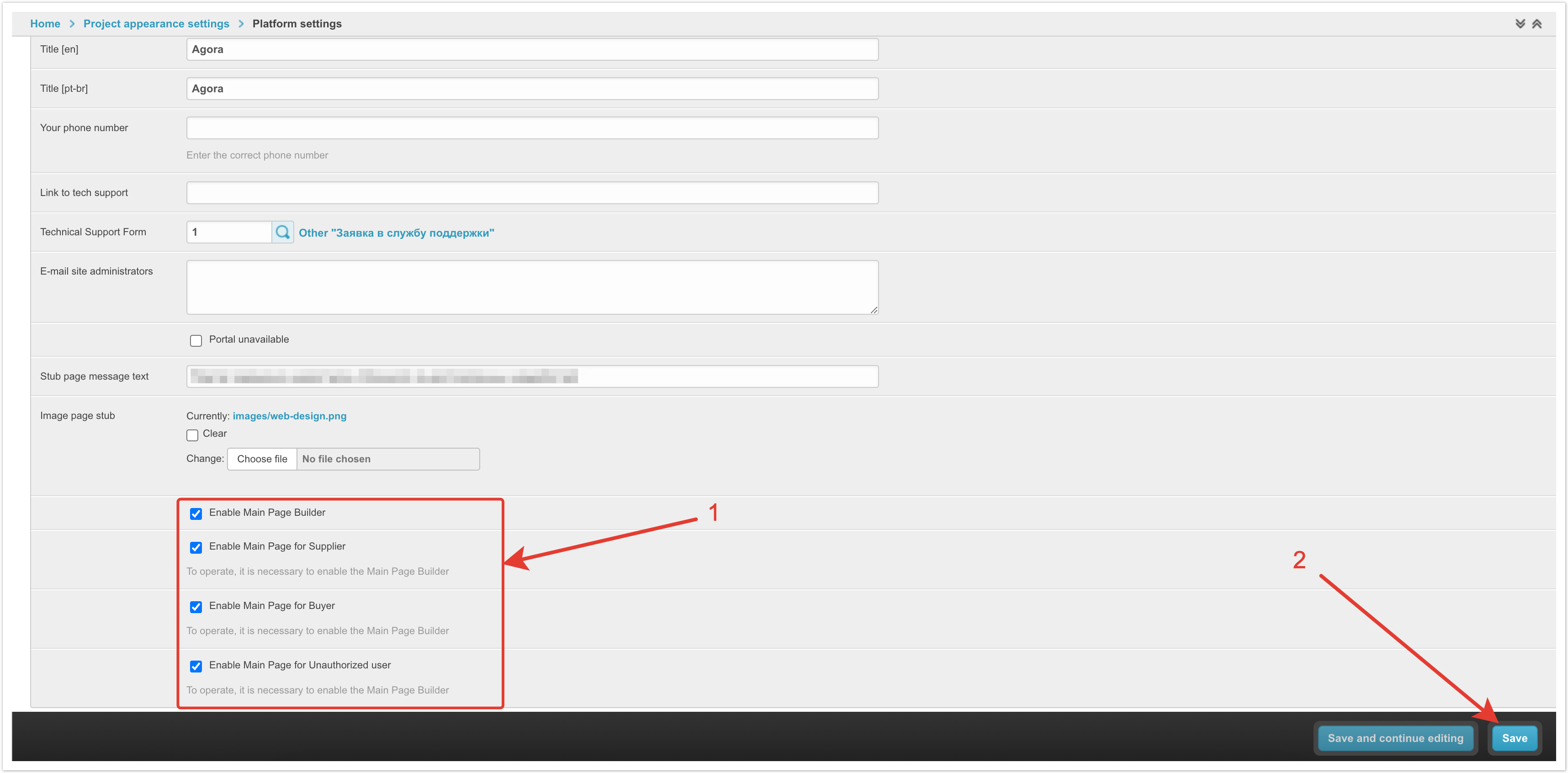
Connecting the home page builderYou can use the standard view of the main page or customize it individually through the designer. The main page builder is connected through the admin panel. You need to go to the Platform settings section.
In the Information about the portal section, set the checkbox Enable Main Page Builder. This setting enables the custom home page and works in conjunction with the settings for individual roles: Enable Main Page for Supplier - is responsible for displaying the customized home page to users with the role of Supplier. Enable Main Page for Buyer - is responsible for displaying the customized home page to users with the role of Buyer. Enable Main Page for Unauthorized user - is responsible for displaying the customized home page for all users who have not yet been authorized in the system. Users for whom the display of the home page is not enabled will see its standard version, and not the customized one using the designer.
Next, you need to save the changes for the setting to take effect.
After that, using the settings of the main project page, you can change its appearance.
Setting up the site headerHeader is located at the top of the page and contains by default:
In addition, a block of information, a currency exchange rate, a language switcher, a contact phone number and a button to enter your personal account can also be displayed on top.
All other sections are configured manually through the admin panel. To set the page header, go to the Header section.
The page that opens displays the header sections that were previously configured.
Position in the status bar - this column, using the Drag-and-drop functionality, allows you to change the order in which sections are displayed on the page. It is enough to drag the gray rectangle in the desired line and move it to the place that it should occupy. ID - unique identifier of the section. Name - the name of the section that will be displayed on the main page. Icon - a visual display that will also be displayed on the main page. URL - the address of the link that will be followed by clicking on this section on the main page. Removing header sectionsTo delete some of the available sections of the header, you need to select them with checkboxes in the first column, and then select Delete selected Header from the drop-down list at the bottom left.
Adding Header SectionsTo add a new section to the header, click the Add Header button in the upper right corner of the page.
On the page that opens, you need to fill in the fields to add a new section.
Name - this field specifies the name that will be displayed on the main page. If multilanguage is enabled on the platform, you can specify the name in different languages. URL - the address of the link that will be followed by clicking on this section on the main page. The URL address can lead both to internal pages of the platform and to external sites. Icon - a visual display that will also be displayed on the main page. You can select an icon from the available catalog, which includes several hundred images. For convenience, a search bar is displayed that allows you to find an icon by name.
If the list of icons does not contain the one you need, you can download it yourself. To do this, select Upload your own icon, and then select a SVG file on your computer and add it to the platform. The recommended size for the icon is 16x16 px.
After all the required parameters have been filled in, you need to save the Header and it will appear in the list.
Setting up homepage blocksBelow the header, the main page blocks are displayed. The configuration is done through the admin panel in the Page constructor blocks of the page builder.
On the page that opens, the blocks of the main page that were entered earlier are displayed.
Position in the status bar - this column, using the Drag-and-drop functionality, allows you to change the order in which blocks are displayed on the page. It is enough to drag the gray rectangle in the desired line and move it to the place that it should occupy. ID - unique identifier of the page constructor block. Name - the name of the block, which will allow the platform administrator to better navigate. Some of the titles will be displayed on the main page. Block type - this column displays the type of this block. More about block types will be described below. Removing Page constructor BlocksTo remove some of the available page builder blocks, you need to select them with checkboxes in the first column, and then select Delete selected Page constructor blocks from the drop-down list at the bottom left.
|


| Якорь | ||||
|---|---|---|---|---|
|

Slider
| Информация | ||
|---|---|---|
| ||
This type of block allows you to upload multiple images that will scroll through the slider. Recommended image sizes for the slider: For desktop version - 1380x300 px For mobile version - 800x285 px |

Consider the slider setup procedure.

Name - the name of the block, which will allow the platform administrator to better navigate. It will not appear on the main page. If multilanguage is enabled on the platform, you can specify the name in different languages in the corresponding fields.
Preview - in this field you can see an example of the display of this block.
In the Slider block, you can enable the Autochange checkbox so that the image changes automatically. If the setting is disabled, then switching images will only be available manually.
Change time - this field specifies the time in seconds after which the images will be changed.
In the Banners section on the main page, you can upload images for banners. To do this, click on the "+".

Fields for uploading and customizing the image will appear. In the Image column, select the file you want to upload.Якорь banner banner
In the Slider banner for desktop version and Slider banner for mobile version columns, you can see the format for the respective versions and select the display area.
In the File for column, you can select the version for which the image is being uploaded. You can upload separate images in different size for the desktop and mobile versions of the page display.
The URL adress column contains the link that will be followed when clicking on the banner. The link may lead to sections of the platform or to third-party sites.
In the Display order column, you can set the order in which images are displayed in the slider.

This way you can upload all the images that should be displayed in the slider. At the same time, you can upload images of different size for mobile and desktop versions. For each image, you can select the display area that will be displayed on the main page.
3 banners in a row - one size
| Информация | ||
|---|---|---|
| ||
This type of block allows you to upload 3 images for banners, which will be displayed in one row and of same size. Recommended sizes for 3 banners in a row of the same size: For desktop version - 460x205 px For mobile version - 120x115 px |

Consider the procedure for setting up a block 3 banners in a row - one size.

Name - the name of the block, which will be displayed on the main page above the block with banners. If multilanguage is enabled on the platform, then you can specify the name in different languages in the appropriate fields.
Headline placement - this field has 3 values: On the Left side (on the website page), In the Middle (on the website page), On the Right side (on the website page). Depending on the selected value, the title specified in the Name field will be displayed on the left, in the middle or on the right above the banners.
Preview - in this field you can see an example of the display of this block.
In the Banners on the main page section, you can upload banner images. To do this, click on the "+". Next, the images are loaded and the setup is performed in the same way as described for the slider.
Information block
| Информация | ||
|---|---|---|
| ||
This type of block allows you to add text along with an image to the main page, as well as add a link to go to. Recommended sizes for images in the information block: For desktop version - 480x335 px For mobile version - 370x224 px |

Consider the procedure for setting up an information block.

Name - the name of the block, which will be displayed on the main page above the block with text. If multilanguage is enabled on the platform, then you can specify the name in different languages in the appropriate fields.
Headline placement - this field has 3 values: On the Left side (on the website page), In the Middle (on the website page), On the Right side (on the website page). Depending on the selected value, the title specified in the Name field will be displayed on the left, in the middle or on the right above the banners. In this block, the Text placement setting, which will be described below, has a higher priority.
Preview - in this field you can see an example of the display of this block.

Block content - this field specifies the text that should be displayed in this block on the main page.
Text placement - this field has 2 values: On the Left side (on the website page) and On the Right side (on the website page). Depending on the selected value, the text will be displayed to the left or right of the image.
Button name - here you specify the text that will be indicated on the button displayed under the text.
Button type - this field has 3 values:
Line button -  a button with an outline and no color fill.
Solid button -  button filled with color.
Text (link) -  link without a button.
Depending on the selected value, the display format of the button will differ.
URL address - this field specifies the link that will be followed when the button is clicked. The link may lead to sections of the platform or to third-party sites.
Image - this field uploads an image that will accompany the text. After saving the changes, in the last two fields you can select the image display area for the desktop and mobile versions.
News block
| Информация | ||
|---|---|---|
| ||
This type of block allows you to display a list of news on the main page. |

Consider the procedure for setting up a news block.

Name - the name of the block, which will be displayed on the main page above the block with news. If multilanguage is enabled on the platform, then you can specify the name in different languages in the appropriate fields.
Headline placement - this field has 3 values: On the Left side (on the website page), In the Middle (on the website page), On the Right side (on the website page). Depending on the selected value, the title specified in the Name field will be displayed on the left, in the middle or on the right above the list of news.
Preview - in this field you can see an example of the display of this block.
Button name - here you specify the text that will be indicated on the button displayed under the news block.
URL address - this field specifies the link that will be followed by clicking on the button under the news block. The link may lead to sections of the platform or to third-party sites.
In the last field, you can select options:
Show latest (4) news - this option will display the last 4 news loaded.
Show selected news - with this option, you can select the news that will be displayed in the block on the main page.

Products block
| Информация | ||
|---|---|---|
| ||
This block type allows you to add products to the main page. Products can be added to the shopping cart, comparison list or favorites directly from the main page. |

Consider the procedure for setting up a block with products.

Name - the name of the block, which will be displayed on the main page above the block with products. If multilanguage is enabled on the platform, then you can specify the name in different languages in the appropriate fields.
Headline placement - this field has 3 values: On the Left side (on the website page), In the Middle (on the website page), On the Right side (on the website page). Depending on the selected value, the title specified in the Name field will be displayed on the left, in the middle or on the right above the products.
Preview - in this field you can see an example of the display of this block.

Product display type - this field has 3 values: Carousel, Statics, Statics Promo. Consider the features of each type.
Carousel - a display type in which products are displayed 5 products per page and buttons for scrolling through the product carousel are displayed on the right. You can scroll through them both forward and backward.

Statics - display type, in which the selected products are statically displayed on the page. With this option, all products that are selected for display will be displayed.

Statics Promo - display type, in which 7 products are displayed in the block. The card of one of the products is stretched vertically and has a larger size than the other 6. The rest of the items are the same size. This type of display is relevant for products that are subject to discounts on the platform.

Let's go back to the rest of the settings.
Sort - in this field you can select the sorting option for the products in the block. There are also 3 values here:
Price Ascending - products will be displayed in ascending order of price.
Descending price - products will be displayed in descending order of prices.
Random - products will be displayed randomly, without specific conditions.
Depending on the selected value, the order of output of products will change.
Next, select the list of products that will be displayed.
Show only selected products - when you select this value in the Manual selection of products field, you need to specify specific positions that should be displayed in this block.
Show only selected products (categories, subcategories) - when you select this value in the Category field, you must select specific categories of products that will be displayed in this block.
Display products in the price range from and Display products in the price range to - in these fields, you can specify additional conditions for the price range for displaying products. For example, if you choose to display an entire category, you can set a specific price range. In this case, not all products of the category will be displayed, but only those that meet the conditions.
Number of items to display - this field specifies the number of products that will be displayed in the block. For the Carousel and Statics display types, a maximum of 50 products can be displayed. For the Statics Promo type, a maximum of 7 products can be displayed.

There are several features when setting up the Statics Promo display type. The Category field displays only those categories for which there are discounts on the platform. In the Manual selection of products field, only those products that are subject to discounts will also be available for selection.
Main product card - in this field you can select a product that will be displayed large in the first place in the block.
2 banners in a line
| Информация | ||
|---|---|---|
| ||
This type of block allows you to upload 2 images for banners, which will be displayed in one line and of equal size. Recommended sizes for 2 banners in a line: For desktop version - 697x220 px For mobile version - 185x125 px |

The procedure for setting up the block 2 banners in a line is the same as for 3 banners in a line, let's consider it.

Name - the name of the block, which will be displayed on the main page above the block with banners. If multilanguage is enabled on the platform, then you can specify the name in different languages in the appropriate fields.
Headline placement - this field has 3 values: On the Left side (on the website page), In the Middle (on the website page), On the Right side (on the website page). Depending on the selected value, the title specified in the Name field will be displayed on the left, in the middle or on the right above the banners.
Preview - in this field you can see an example of the display of this block.
In the Banners on the main page section, you can upload banner images. To do this, click on the "+". Next, the images are loaded and the setup is performed in the same way as described for the slider.
Text
| Информация | ||
|---|---|---|
| ||
This type of block allows you to add text to the page. For example, you can enter company information. |

Consider the procedure for setting up a text block.

Name - the name of the block, which will be displayed on the main page above the block with text. If multilanguage is enabled on the platform, then you can specify the name in different languages in the appropriate fields.
Preview - in this field you can see an example of the display of this block.
Block content - this field specifies the text that should be displayed on the main page. As well as for the Name field, you can specify content in different languages for platforms on which multilanguage is enabled.
1 banner in a line
| Информация | ||
|---|---|---|
| ||
This block type allows you to upload one image as a banner. Recommended size for 1 banner in a line: For desktop version - 1380x160 px For mobile version - 350x70 px |

The procedure for setting up the block 1 banner in a line is the same as for other banners, let's consider it.

Name - the name of the block, which will be displayed on the main page above the block with banner. If multilanguage is enabled on the platform, then you can specify the name in different languages in the appropriate fields.
Headline placement - this field has 3 values: On the Left side (on the website page), In the Middle (on the website page), On the Right side (on the website page). Depending on the selected value, the title specified in the Name field will be displayed on the left, in the middle or on the right above the banner.
Preview - in this field you can see an example of the display of this block.
In the Banners on the main page section, you can upload banner images. To do this, click on the "+". Next, the images are loaded and the setup is performed in the same way as described for the slider.
3 banners in a line - different size
| Информация | ||
|---|---|---|
| ||
This type of block allows you to upload 3 images for banners. The first image will be stretched vertically. The other two images will be the same size and stacked on top of each other. Recommended sizes for 3 banners in a row of different sizes: For the first banner in the desktop version - 560x560 px For the first banner in the mobile version - 370x273 px For other banners in the desktop version - 795x270 px For other banners in the mobile version - 370x129 px |

The procedure for setting up the 3rd banner block in a line is the same as for other banners, let's consider it.

Name - the name of the block, which will be displayed on the main page above the block with banners. If multilanguage is enabled on the platform, then you can specify the name in different languages in the appropriate fields.
Headline placement - this field has 3 values: On the Left side (on the website page), In the Middle (on the website page), On the Right side (on the website page). Depending on the selected value, the title specified in the Name field will be displayed on the left, in the middle or on the right above the banners.
Preview - in this field you can see an example of the display of this block.
In the Banners on the main page section, you can upload banner images. To do this, click on the "+". Next, the images are loaded and the setup is performed in the same way as described for the slider. Additionally, two columns are also displayed to indicate the display area of the first banner, which is stretched vertically, in desktop and mobile versions. The first banner is selected based on the specified display order.
| Примечание | ||
|---|---|---|
| ||
If you have any questions about using or configuring the functionality, please contact AGORA technical support. |
| Sv translation | |||||||||||||||||||||||||||||||||||||||||||||||||||||||||||||||||||||||||
|---|---|---|---|---|---|---|---|---|---|---|---|---|---|---|---|---|---|---|---|---|---|---|---|---|---|---|---|---|---|---|---|---|---|---|---|---|---|---|---|---|---|---|---|---|---|---|---|---|---|---|---|---|---|---|---|---|---|---|---|---|---|---|---|---|---|---|---|---|---|---|---|---|---|
| |||||||||||||||||||||||||||||||||||||||||||||||||||||||||||||||||||||||||
Layout adaptativoQuando você configura blocos da página principal, você pode carregar imagens em diferentes resoluções para exibição em um computador e em um dispositivo móvel. Isso permite que você implemente a adaptabilidade completa para exibir a página em qualquer dispositivo. Um exemplo de exibição da página-mestre em um computador:
Um exemplo de exibição da página principal em um tablet:
Um exemplo de exibição da página inicial em um telefone:
Conectando o Master Page DesignerVocê pode usar a visão padrão da página principal ou personalizá-la individualmente através do designer. Você conecta o designer de páginas principais através do painel de administração. Você precisa ir para a seção Configurações da plataforma.
Na seção Informações sobre o Portal, instale o Habilitar o construtor de páginas principais. Essa configuração inclui uma página mestra personalizada e funciona em conjunto com as configurações de funções individuais: Habilitar Página principal para o Fornecedor - responsável por exibir uma home page personalizada para usuários com a função Vendor. Habilitar Página Principal para o Comprador - responsável por exibir uma página principal personalizada para usuários com a função de comprador. Habilitar Página principal para o Usuário Não Autorizad - responsável por exibir uma página inicial personalizada para todos os usuários que ainda não foram logados no sistema. Os usuários para os quais a exibição da página principal não está habilitada verão sua versão padrão e não personalizada usando o construtor.
Em seguida, você precisa salvar as alterações para que a configuração se aplique.
Em seguida, você pode usar as configurações principais da página do projeto para alterar sua aparência.
Configurar cabeçalho do siteHeader está localizado na parte superior da página e contém por padrão:
Além disso, um bloco de informações, uma taxa de câmbio, um switcher para comutação de idiomas, um número de telefone de contato e um botão para inserir uma conta pessoal também podem ser exibidos em cima.
Todas as outras seções são configuradas manualmente através do painel de administração. Para configurar o cabeçalho da página, vá para a seção Header.
A página que abre exibe seções de cabeçalho que foram configuradas anteriormente.
Posição na linha de produtos - esta coluna com a ajuda da funcionalidade Arrastar e soltar permite alterar a ordem da saída das seções na página. Basta puxar o retângulo cinza na linha desejada e transferi-lo para o lugar que ele deve ocupar. ID - identificador único da seção. Nome - o nome da seção, que será exibido na página principal. Ícone - display visual, que também será exibido na página principal. URL - o endereço do link que será clicado quando você clicar nesta seção na página principal. Excluindo partições de cabeçalhoPara excluir algumas das seções de cabeçalho disponíveis, você precisa destacá-las com caixas de seleção na primeira coluna e, em seguida, na parte inferior esquerda na lista de retirada, selecione Remover Header selecionados.
Adicionar seções de cabeçalhoPara adicionar uma nova seção ao cabeçalho, clique no botão Adicionar Header no canto superior direito da página.
Na página que abre, você precisa preencher os campos para adicionar uma nova seção.
Nome - este campo especifica o nome que será exibido na página principal. Se o multilíngue estiver ativado na plataforma, então você pode especificar o nome em diferentes idiomas. URL - o endereço do link que será clicado quando você clicar nesta seção na página principal. O endereço URL pode levar tanto a páginas internas da plataforma quanto a sites externos. Ícone - display visual, que também será exibido na página principal. Você pode selecionar um ícone em um catálogo disponível que inclui várias centenas de imagens. Por conveniência, uma barra de pesquisa é exibida, o que permite encontrar o ícone pelo nome.
Se não houver um necessário na lista de ícones, então você mesmo pode baixá-lo. Para fazer isso, selecione Carregar seu próprio ícone e, em seguida, selecione o arquivo SVG no seu computador e adicione-o à plataforma. O tamanho recomendado para o ícone é 16x16 px.
Depois de todos os parâmetros necessários terem sido preenchidos, você precisa salvar o Header e ele aparecerá na lista.
Personalização de blocos de página mestreOs blocos da página principal são exibidos abaixo do cabeçalho. A configuração é realizada através do painel de administração na seção Blocos construtores da página.
A página que abre exibe os blocos da página-mestre que você criou anteriormente.
Posição na linha de produtos - esta coluna com a ajuda da funcionalidade arrastar e soltar permite alterar a ordem de saída dos blocos na página. Basta puxar o retângulo cinza na linha desejada e transferi-lo para o lugar que ele deve ocupar. ID - identificador exclusivo do bloco de construção de páginas. Nome - o nome do bloco, que permitirá ao administrador da plataforma navegar melhor. Alguns dos títulos serão exibidos na página principal. Tipo de bloco - esta coluna exibe o tipo deste bloco. Mais informações sobre tipos de blocos serão descritas abaixo. Excluir blocos construtores da páginaPara remover qualquer um dos blocos de construtor de páginas disponíveis, você precisa destacá-los com caixas de seleção na primeira coluna e, em seguida, na parte inferior esquerda na lista de drop-down, selecione Remover Blocos de construtores de página selecionados.
|


| Якорь | ||||
|---|---|---|---|---|
|

Slider
| Информация | ||
|---|---|---|
| ||
Este tipo de bloco permite que você carregue várias imagens que serão percorridas pelo controle deslizante. Tamanhos recomendados para imagens deslizantes: Para versão desktop - 1380x300 px Para versão móvel - 800x285 px |

Vamos ver a ordem de configurar o slider.

Nome - o nome do bloco, que permitirá ao administrador da plataforma navegar melhor. Não aparecerá na página principal. Se o multilíngue estiver ativado na plataforma, então você pode especificar o nome em diferentes idiomas nos campos apropriados.
Preview - neste campo você pode ver um exemplo de exibição deste bloco.
No bloco Slider, você pode ligar a caixa de seleção do Troca automática para que a imagem mude automaticamente. Se a configuração estiver desativada, a comutação de imagens estará disponível apenas manualmente.
Tempo de troca - este campo indica o tempo em segundos após o qual as imagens serão alteradas.
No bloco Banners na página principal, você pode enviar imagens para banners. Para fazer isso, clique em "+".

Campos para carregar e ajustar a imagem serão exibidos. Na coluna Imagem, selecione o arquivo que deseja carregar. Якорь banner banner
No Banner do slider para versão desktop e Banner do slider para versão mobile, você pode ver o formato das respectivas versões e selecionar a área de exibição.
Na coluna Arquivo para obter, você pode selecionar a versão para a qual a imagem é carregada. Você pode carregar imagens individuais em diferentes resoluções para as versões desktop e mobile do display da página.
A coluna Endereço URL especifica o link que será clicado quando você clicar no banner. O link pode levar a seções da plataforma ou a sites de terceiros.
Na coluna Ordem de exibição, você pode especificar a ordem em que as imagens aparecem no controle deslizante.

Desta forma, você pode carregar todas as imagens que deseja exibir no controle deslizante. Ao mesmo tempo, você pode carregar imagens de diferentes resoluções para as versões móvel e desktop. Para cada imagem, você pode selecionar a área de exibição que aparecerá na página principal.
3 banners seguidos - um tamanho
| Информация | ||
|---|---|---|
| ||
Este tipo de bloco permite que você carregue 3 imagens para banners, que serão exibidos em uma linha e de tamanho igual. Tamanhos recomendados para 3 banners por linha do mesmo tamanho: Para versão desktop - 460x205 px Para versão móvel - 120x115 px |

Vamos considerar a ordem de configurar banners de bloco 3 banners seguidos - um tamanho.

Nome - o nome do bloco, que será exibido na página principal acima do bloco com banners. Se o multilíngue estiver ativado na plataforma, então você pode especificar o nome em diferentes idiomas nos campos apropriados.
Localização do cabeçalho - neste campo há 3 valores: No lado esquerda (na página do site), No meio (na página do site), No lado direita (na página do site). Dependendo do valor selecionado, o título especificado no campo Nome será exibido à esquerda, no meio ou direito acima dos banners.
Preview - neste campo você pode ver um exemplo de exibição deste bloco.
No bloco Banners na página principal, você pode carregar uma imagem de banners. Para fazer isso, clique em "+". Em seguida, as imagens são carregadas e o ajuste é realizado da mesma forma descrito para o slider.
Bloco de informações
| Информация | ||
|---|---|---|
| ||
Este tipo de bloco permite adicionar texto junto com a imagem à página principal, bem como adicionar um link para ir. Dimensões recomendadas para a imagem no bloco de informações: Para versão desktop - 480x335 px Para versão móvel - 370x224 px |

Vamos considerar o procedimento para configurar o bloco de informações.

Nome - o nome do bloco, que será exibido na página principal acima do bloco com o texto. Se o multilíngue estiver ativado na plataforma, então você pode especificar o nome em diferentes idiomas nos campos apropriados.
Localização do cabeçalho - neste campo há 3 valores: No lado esquerda (na página do site), No meio (na página do site), No lado direita (na página do site). Dependendo do valor selecionado, o título especificado no campo Nome será exibido à esquerda, no meio ou direito acima do texto. Neste bloco, a configuração de localização do texto é uma prioridade maior, que será descrita mais tarde.
Preview - neste campo você pode ver um exemplo de exibição deste bloco.

Conteúdo no bloco - este campo indica o texto que deve ser exibido neste bloco na página principal.
Localização do botão - há 2 valores neste campo: No lado esquerda (na página do site) e No lado direita (na página do site). Dependendo do valor selecionado, o texto será exibido à esquerda ou à direita da imagem.
Nome do botão - aqui está o texto que será indicado no botão exibido abaixo do texto.
Tipo de botão - há 3 valores neste campo:
Line button -  botão com contorno e sem preenchimento de cor.
Solid button -  um botão com um preenchimento de cor.
Text (link) -  um link sem botão.
Dependendo do valor selecionado, o formato de exibição do botão será diferente.
Endereço URL - este campo especifica o link que será clicado quando você clicar no botão. O link pode levar a seções da plataforma ou a sites de terceiros.
Imagem - neste campo, a imagem que acompanhará o texto é carregada. Depois de salvar as alterações, nos dois últimos campos você pode selecionar a área de exibição de imagens para as versões desktop e mobile.
Bloco de Notícias
| Информация | ||
|---|---|---|
| ||
Este tipo de bloco permite que você exiba uma lista de notícias na página principal. |

Vamos considerar o procedimento para criar um bloco de notícias.

Nome - o nome do bloco, que será exibido na página principal acima do bloco com novidades. Se o multilíngue estiver ativado na plataforma, então você pode especificar o nome em diferentes idiomas nos campos apropriados.
Localização do cabeçalho - neste campo há 3 valores: No lado esquerda (na página do site), No meio (na página do site), No lado direita (na página do site). Dependendo do valor escolhido, o título especificado no campo Nome aparecerá à esquerda, meio ou direito acima da lista de notícias.
Preview - neste campo você pode ver um exemplo de exibição deste bloco.
Nome do botão - aqui você pode especificar o texto que será indicado no botão exibido no bloco de notícias.
Endereço URL - este campo indica o link que será usado para navegar quando você clicar no botão sob o bloco de notícias. O link pode levar a seções da plataforma ou a sites de terceiros.
No último campo, você pode selecionar as seguintes opções:
Mostre últimas (4) notícias - esta opção exibirá 4 notícias baixadas pelas últimas.
Mostrar notícias selecionadas - com esta opção, você pode selecionar as notícias que serão exibidas no bloco na página principal.

Bloco de produtos
| Информация | ||
|---|---|---|
| ||
Este tipo de bloco permite adicionar produtos à página principal. Os produtos podem ser adicionados ao carrinho, à lista de comparação ou aos favoritos diretamente da página principal. |

Vamos considerar o procedimento para montar um bloco de produtos.

Nome - o nome do bloco, que será exibido na página principal acima do bloco com produtos. Se o multilíngue estiver ativado na plataforma, então você pode especificar o nome em diferentes idiomas nos campos apropriados.
Localização do cabeçalho - neste campo há 3 valores: No lado esquerda (na página do site), No meio (na página do site), No lado direita (na página do site). Dependendo do valor escolhido, o título especificado no campo Nome aparecerá à esquerda, meio ou direito acima dos produtos.
Preview - neste campo você pode ver um exemplo de exibição deste bloco.

Tipo de exibição do produto - há 3 valores neste campo: Carrossel, Estática, Promoção Estática. Considere as características de cada um dos tipos.
Carrossel é um tipo de display no qual os produtos são exibidos em 5 produtos na página e botões são exibidos à direita para virar o carrossel com mercadorias. Você pode rolar através deles tanto para frente quanto para trás.

Estática é um tipo de display no qual os produtos selecionados são exibidos estaticamente na página. Com esta opção, todos os produtos selecionados para exibição serão exibidos.

Promoção Estática - tipo de display, no qual 7 produtos são exibidos em um bloco. O cartão de um dos produtos é esticado verticalmente e tem um tamanho maior que o outro 6. O resto das mercadorias são de tamanho igual. Esse tipo de display é relevante para produtos para os quais os descontos são aplicados na plataforma.

Vamos voltar para o resto das configurações.
Ordenação - neste campo você pode selecionar a opção de classificar mercadorias no bloco. Há também 3 significados:
Aumento de preços - as mercadorias serão exibidas por ordem de aumento de preços.
Preço descendente - as mercadorias serão exibidas em ordem descendente de preços.
Aleatoriamente - as mercadorias serão exibidas em uma ordem aleatória, sem condições específicas.
Dependendo do valor selecionado, a ordem de saída das mercadorias mudará.
Em seguida, uma lista de produtos é selecionada, que será exibida.
Mostrar apenas produtos selecionados - quando você selecionar esse valor na seleção manual de mercadorias, você precisa especificar itens específicos que devem ser exibidos neste bloco.
Mostrar apenas produtos selecionados (categorias, subcategorias) - ao selecionar esse valor no campo Categoria, você deve selecionar categorias específicas de produtos que serão exibidas neste bloco.
Exibir produtos na faixa de preço de e Exibir produtos na faixa de preço até - nestes campos você pode definir condições adicionais para a faixa de preço para a produção de mercadorias. Por exemplo, se você optar por exibir uma categoria inteira, você pode especificar uma faixa de preço específica. Neste caso, nem todos os produtos da categoria serão exibidos, mas apenas aqueles que atendam às condições.
Número de itens para exibir - este campo especifica o número de produtos que serão exibidos no bloco. Para os tipos de Carrossel e de exibição Estática, um máximo de 50 produtos podem ser exibidos. Para as tipo de Promoção Estática, um máximo de 7 produtos podem ser exibidos.

Existem vários recursos ao personalizar o Tipo de Exibição da Promoção Estática. O campo categoria exibe apenas as Categoria para as quais há descontos na plataforma. Na seleção manual de produtos, apenas os produtos para os quais os descontos são válidos também estarão disponíveis para seleção.
Cartão principal do produto - neste campo você pode selecionar o produto que será exibido em grande parte em primeiro lugar no bloco.
2 banners na linha
| Информация | ||
|---|---|---|
| ||
Este tipo de bloco permite que você carregue 2 imagens para banners, que serão exibidos em uma linha e de tamanho igual. Tamanhos de imagem recomendados para 2 banners seguidos: Para versão desktop - 697x220 px Para versão móvel - 185x125 px |

O procedimento para configurar banners de bloco 2 em sequência é semelhante, pois para 3 banners seguidos, vamos considerá-lo.

Nome - o nome do bloco, que será exibido na página principal acima do bloco com banners. Se o multilíngue estiver ativado na plataforma, então você pode especificar o nome em diferentes idiomas nos campos apropriados.
Localização do cabeçalho - neste campo há 3 valores: No lado esquerda (na página do site), No meio (na página do site), No lado direita (na página do site). Dependendo do valor selecionado, o título especificado no campo Nome será exibido à esquerda, no meio ou direito acima dos banners.
Preview - neste campo você pode ver um exemplo de exibição deste bloco.
No bloco Banners na página principal, você pode carregar uma imagem de banners. Para fazer isso, clique em "+". Em seguida, as imagens são carregadas e o ajuste é realizado da mesma forma descrito para o slider.
Texto
| Информация | ||
|---|---|---|
| ||
Esse tipo de bloco permite adicionar texto à página. Por exemplo, você pode especificar informações sobre uma empresa. |

Vamos considerar o procedimento para configurar um bloco de texto.

Nome - o nome do bloco, que será exibido na página principal acima do bloco com o texto. Se o multilíngue estiver ativado na plataforma, então você pode especificar o nome em diferentes idiomas nos campos apropriados.
Preview - neste campo você pode ver um exemplo de exibição deste bloco.
Conteúdo no bloco - este campo indica o texto que deve ser exibido na página principal. Assim como no campo Nome, você pode especificar conteúdo em diferentes idiomas para plataformas nas quais multilíngues estão habilitados.
1 banner na linha
| Информация | ||
|---|---|---|
| ||
Este tipo de bloco permite que você carregue uma única imagem como um banner. Tamanho de imagem recomendado para 1 banner seguido: Para versão desktop - 1380x160 px Para versão móvel - 350x70 px |

A ordem de instalação do bloco 1 banner na linha é a mesma de outros banners, vamos considerar isso.

Nome - o nome do bloco, que será exibido na página principal acima do bloco com o banner. Se o multilíngue estiver ativado na plataforma, então você pode especificar o nome em diferentes idiomas nos campos apropriados.
Localização do cabeçalho - neste campo há 3 valores: No lado esquerda (na página do site), No meio (na página do site), No lado direita (na página do site). Dependendo do valor selecionado, o título especificado no campo Nome será exibido à esquerda, no meio ou direito acima do banner.
Preview - neste campo você pode ver um exemplo de exibição deste bloco.
No bloco Banners na página principal, você pode carregar uma imagem de banner. Para fazer isso, clique em "+". Em seguida, as imagens são carregadas e o ajuste é realizado da mesma forma descrito para o slider.
3 banners na linha - tamanho diferente
| Информация | ||
|---|---|---|
| ||
Este tipo de bloco permite que você carregue 3 imagens para banners. A primeira imagem será esticada verticalmente. As outras duas imagens serão de tamanho igual e empilhadas uma em cima da outra. Tamanhos de imagem recomendados para 3 banners na linha - tamanho diferente: Para o primeiro banner na versão desktop - 560x560 px Para o primeiro banner na versão móvel - 370x273 px Para outros banners na versão desktop - 795x270 px Para outros banners na versão móvel - 370x129 px |

O procedimento para a instalação de banners de bloco 3 em sequência é semelhante, como para outros banners, vamos considerá-lo.

Nome - o nome do bloco, que será exibido na página principal acima do bloco com banners. Se o multilíngue estiver ativado na plataforma, então você pode especificar o nome em diferentes idiomas nos campos apropriados.
Localização do cabeçalho - neste campo há 3 valores: No lado esquerda (na página do site), No meio (na página do site), No lado direita (na página do site). Dependendo do valor selecionado, o título especificado no campo Nome será exibido à esquerda, no meio ou direito acima dos banners.
Preview - neste campo você pode ver um exemplo de exibição deste bloco.
No bloco Banners na página principal, você pode carregar uma imagem de banners. Para fazer isso, clique em "+". Em seguida, as imagens são carregadas e o ajuste é realizado da mesma forma descrito para o slider. Além disso, duas colunas também são exibidas para indicar a área de exibição do primeiro banner, que é esticada verticalmente, nas versões desktop e mobile. O primeiro banner é selecionado com base na ordem de saída especificada.
| Примечание | ||
|---|---|---|
| ||
Se você tiver alguma dúvida sobre o uso ou configuração da funcionalidade, entre em contato com o suporte técnico da AGORA. |